hello@pennybridge.com.au
Phone:
(07) 5534 7761
Address:
20b Fifth Ave, Palm Beach QLD 4221
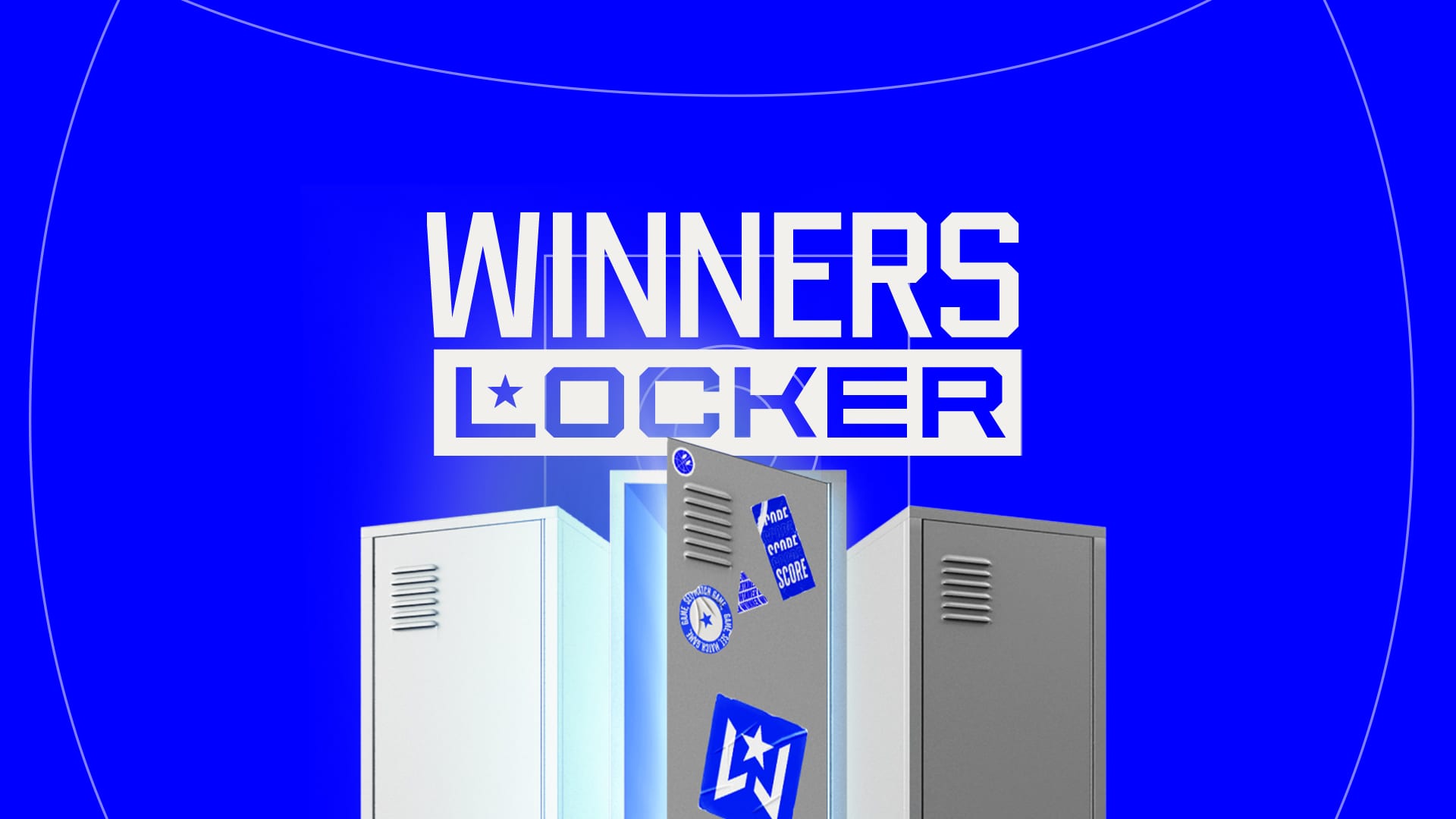
REWARDS BUT NOT AS YOU KNOW IT
WINNERS LOCKER
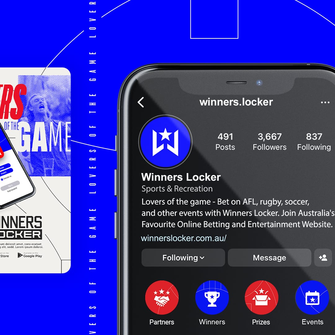
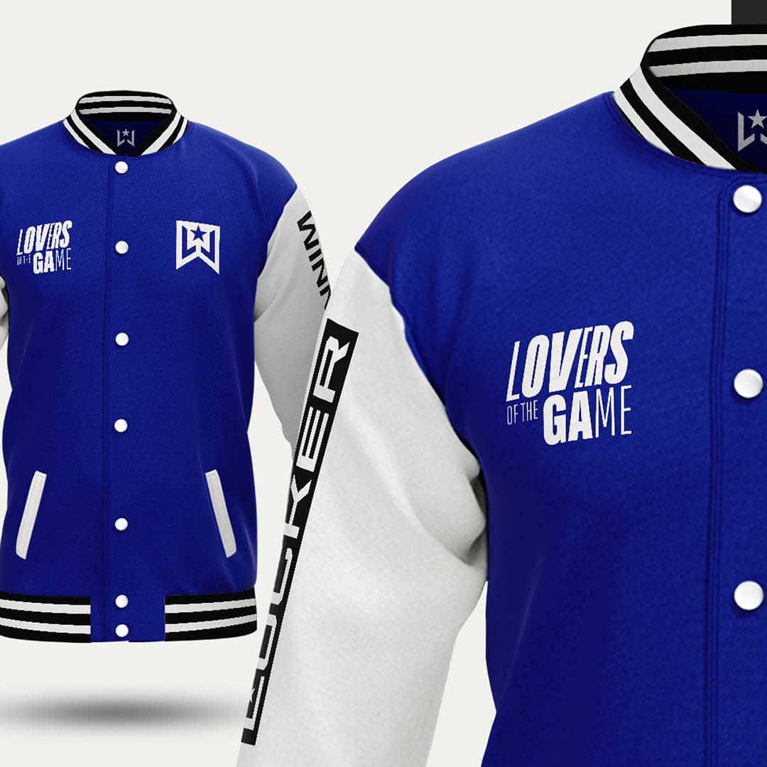
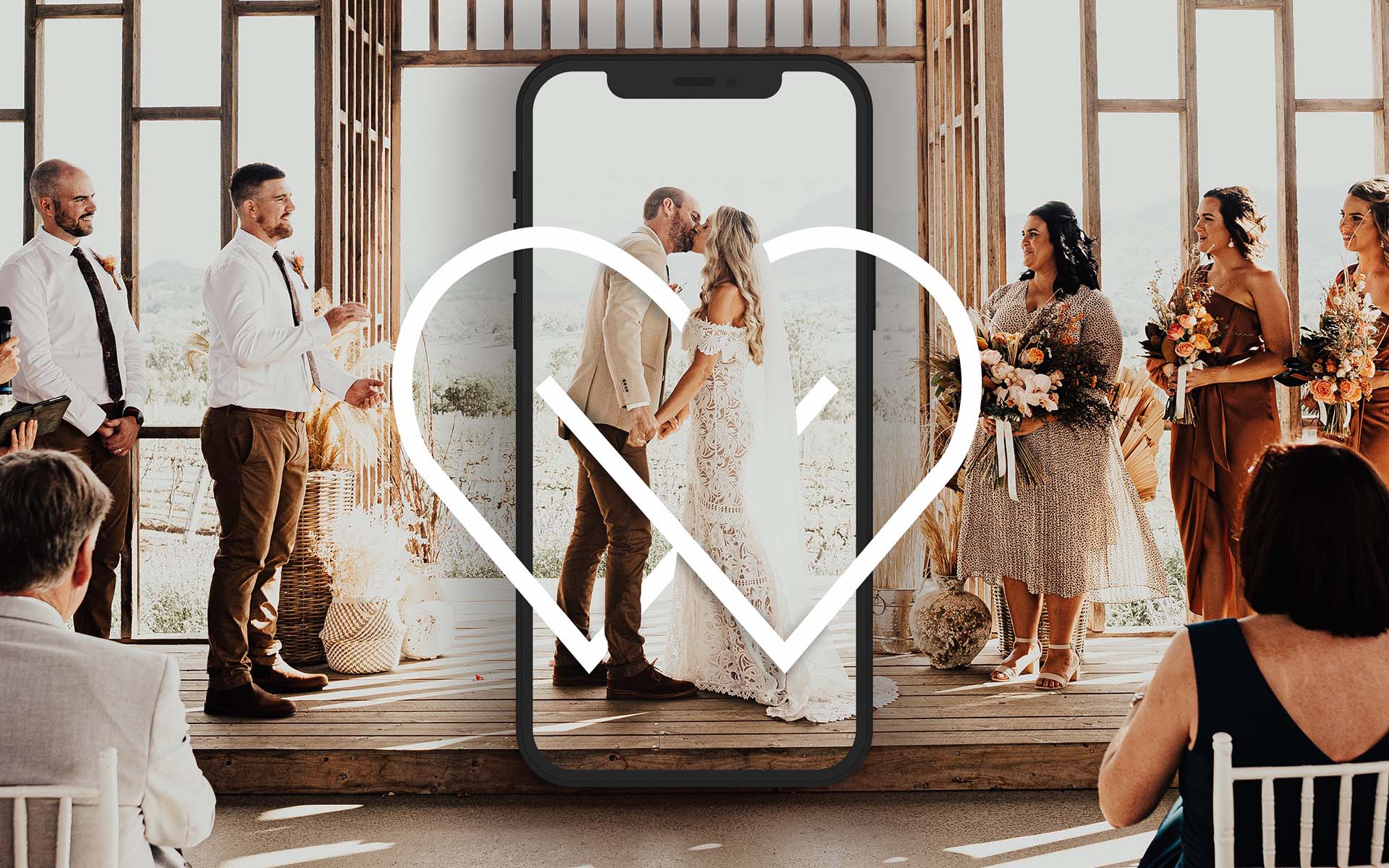
Winners Locker are a new sports membership platform that wanted to take the industry by storm. They understood that branding was going to be the thing that made them stand apart from their competitors and would uplift the industry itself. They wanted something that was going to encompass all sports, look sporty but ultimately would be broad enough that they could scale overseas as well.
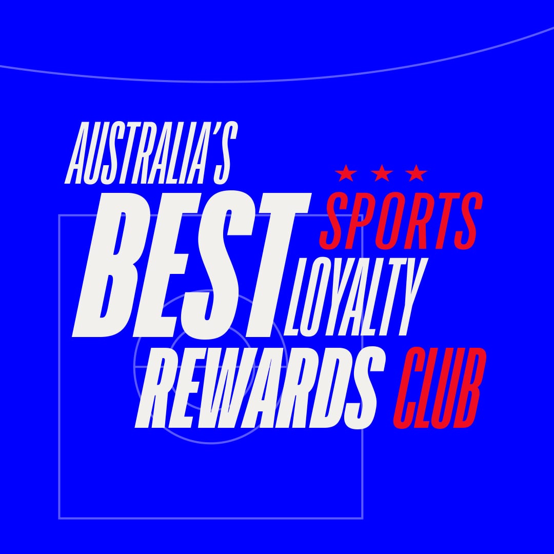
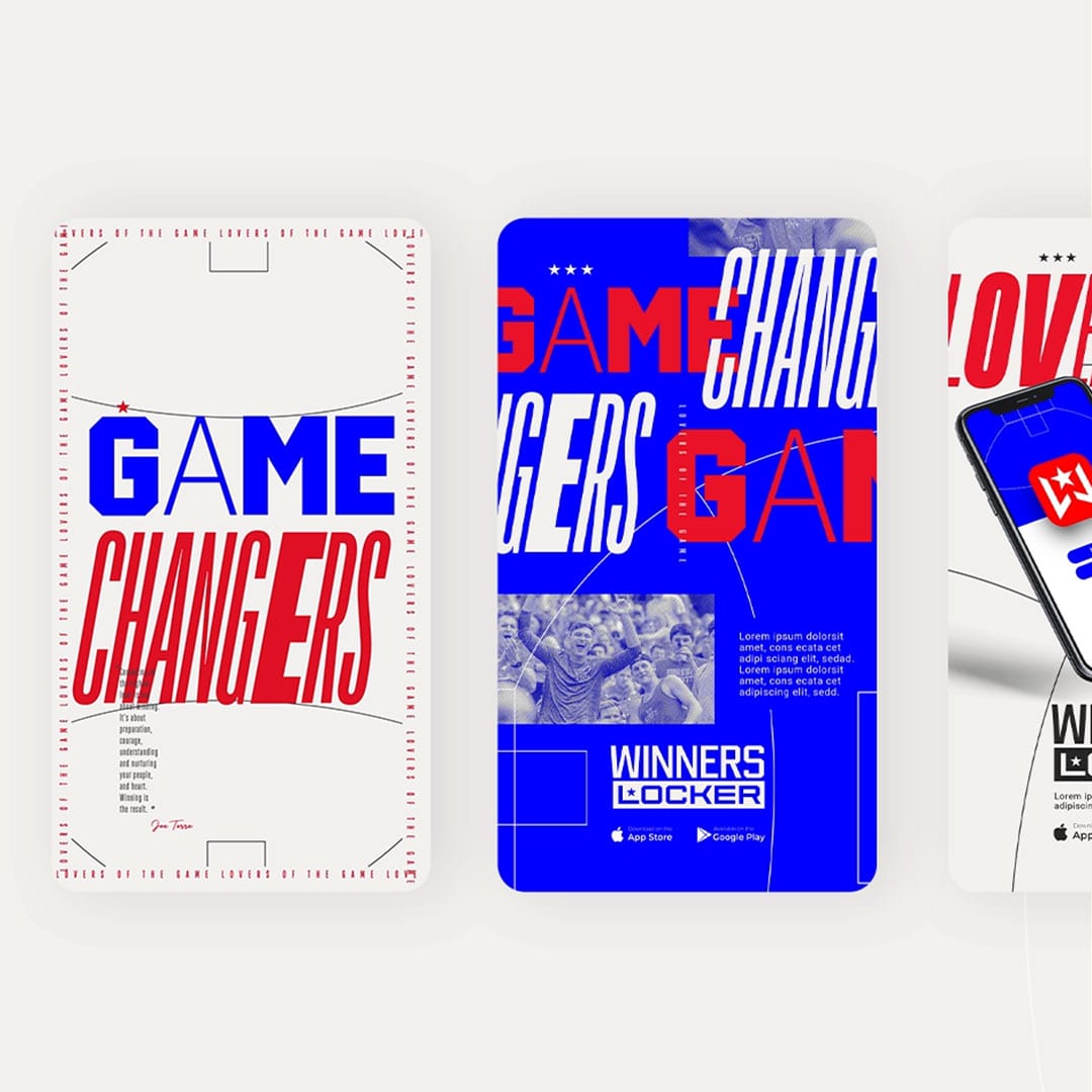
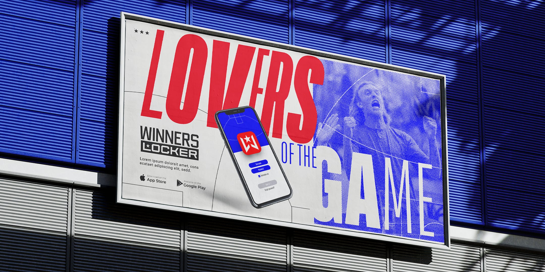
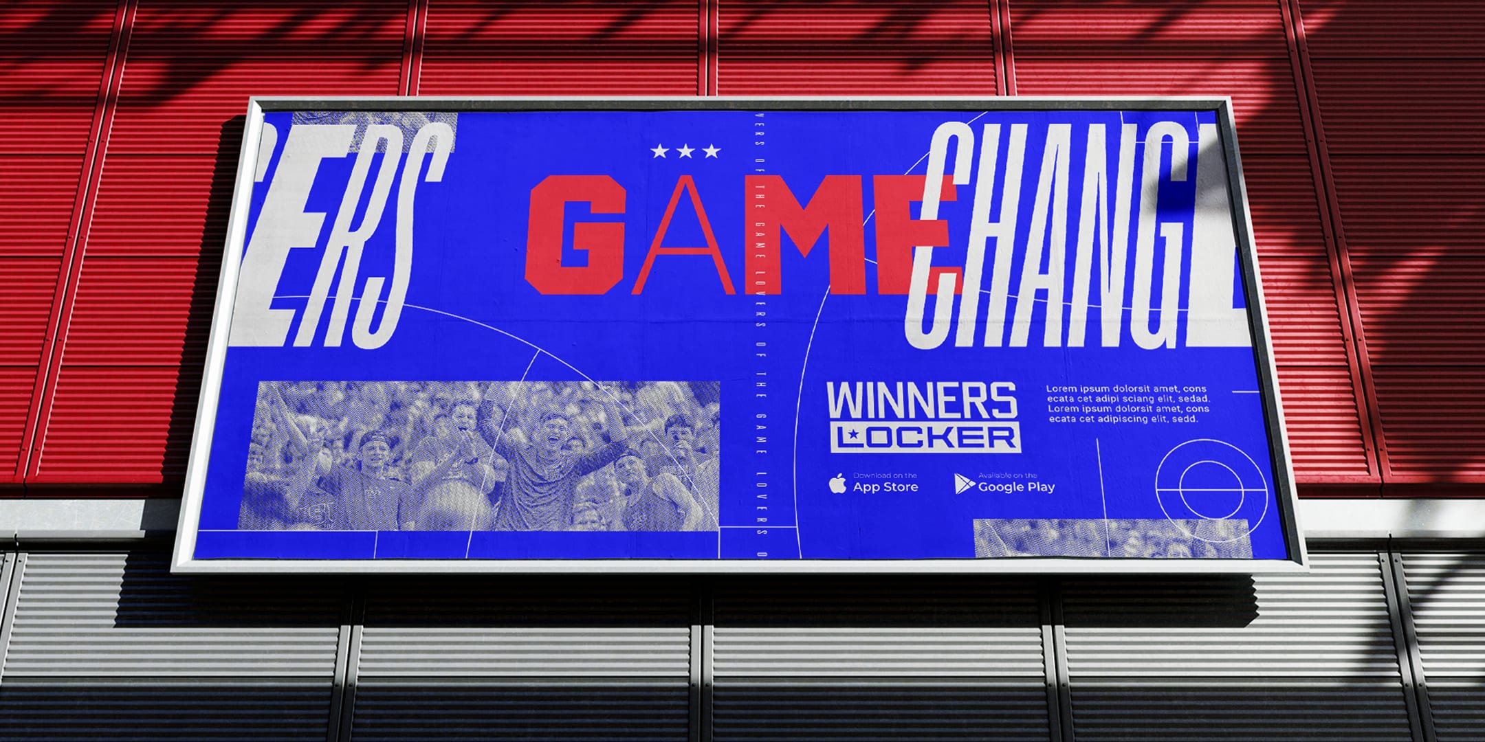
We developed a brand system that relied heavily on type and graphics of fields where we could make the both the fields and type move which showed movement and motion, much like sports. This was because without partnering with the larger sporting brands (NRL, AFL, FIFA, etc.) you can't use imagery which really restricted how they spoke about what they did. Bringing in imagery of the crowd was how we connected with the average punter and the kinetic type is how we told the brand story.
WHAT WE DID
BRAND IDENTITY DESIGN
LOGO DESIGN
BRAND GUIDELINES
PITCH DECK DESIGN
Motion Design
SOCIAL MEDIA KIT
WEBSITE DESIGN
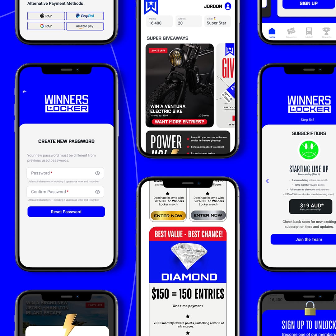
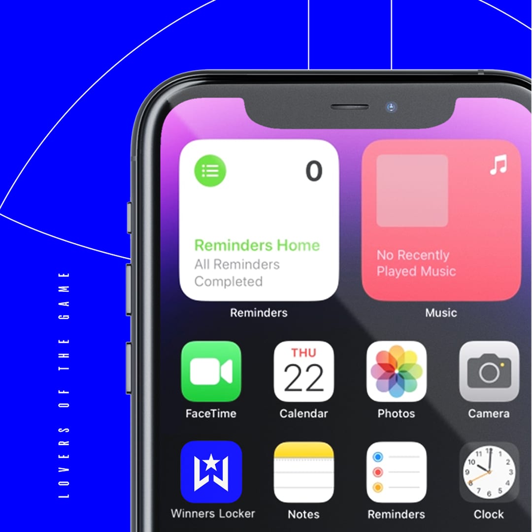
APP DESIGN
"They took an unbranded project with a lot of ideas and distilled it all into a crisp identity that tells the story of the artists we work with and the creative ecology that we're part of on the Gold Coast.
Kiel and Bianca were an absolute pleasure to work with, both bringing great energy and perspectives to the project. They invested the time needed to understand our intention, audience and vision, and the result has made all the facets of what we do feel cohesive and connected. Thank you!
REBECCA ROSS | PROGRAM PRODUCER
Case Studies


STAY UPDATED
NO SPAM, JUST THE GOOD STUFF!



CONTACT /
20b Fifth Avenue,
Palm Beach, QLD 4221
(07) 5534 7761
hello@pennybridge.com.au
INFO /
FOLLOW /
Terms of Use Privacy Policy Code of Conduct